
Design Challenge
Cash App
Dark mode UI challenge
Project Background
FinTech and personal finance have become massive industries since the rise of the internet and more recently the introduction of decentralized (Crypto) currencies.
Personal finance has been a long-term passion of mine, which led to my interest in creating a dark mode version of Square's market leading, Peer to Peer (P2P), personal finance app, Cash App.
Design Challenges
Challenge 1
Develop an accessible and visually pleasing dark mode and style guide of the popular personal finance app, Cash App.
Challenge 2
Recreate Cash App's unique iconography that is on brand.
Challenge 3
Implement something new or different to the app design while learning a new skill.
Kickoff & Overview
In this project, I used a design sprint approach over a one week period.
- I started by mapping out a to-do list of actions and deliverables.
- I conducted primary research using Google search and first hand interaction on my mobile device with Cash App and its competitors.
- Using screenshots from my research for inspiration, I moved straight into creating digital mockups and the dark mode style guide.
- I also recreated Cash App's unique navigation icons and the "Cash App Credit" page with a frosted glass inspired aesthetic.
- Finally, I prototyped all mockup screens to create seamless movement through the primary navigation of the app.
Here were some of my initial decisions and questions:
"The color palette should continue to use Cash App's popping green color to stay on brand"
"Who are Cash App's primary and secondary competitors?"
"How will I recreate the unique icons for this app?"
"I don't have access to Cash App's graphic assets. How can I make the app pages unique while learning a new skill?"
Research & Competitive Analysis
My research began with a simple Google search that included variations of the phrase, "Cash App competitors". This returned not only personal finance apps, but also mobile banking apps for large institutions like Chase, Bank of America, and Wells Fargo. Based on differences in overall product offerings, I decided that large institution apps were limited and do not directly compete with the wider offerings that Cash App has. Ultimately, this led me to look more closely at Venmo, PayPal, Robinhood, SoFi, and Zelle.
Next, I downloaded each app to my mobile device and began exploring the UX and UI of each platform. I analyzed the user flow and primary product offerings of each app. I determined that Venmo, Robinhood, and SoFi are the closest competitors to Cash App because they all offer banking, payments, credit, and crypto in their product line up.
Mockups
After conducting my research, I had a firm grasp on the landscape of personal finance apps. I was ready to jump right into digital design. Here are my Lo-Fi and Hi-Fi mockups.
Low Fidelity

High Fidelity
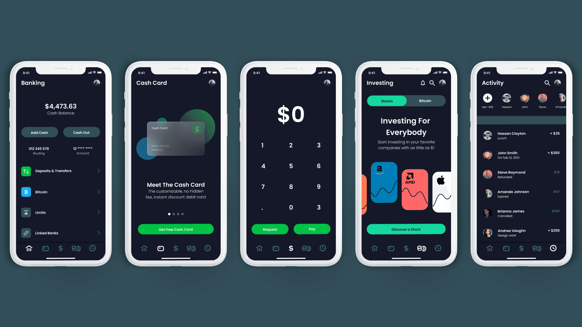
Prototyping
Mockups are cool, but I felt the need for some interaction as well. I took the Hi-Fi mockups and added transitions and overlays to create a more real feeling to the primary navigation.

Challenge 1 — Style Guide
My first decision was to maintain Cash App's popping green color as the main driver of this dark mode challenge. I went on to Adobe Color to explore complementary, monochrome, and shade palette options.
For type, I wanted to select something as close as possible to the type that Cash App currently uses. I don't believe the "Poppins" type is an exact match, but it turned out to be very close.
Buttons remained quite simple. Each variation maintains the same overall width and height. Icons were a bit more tricky since I had to recreate the unique iconography of Cash App. Additional icons were sourced from Google Material Icons. The logo is unchanged from Cash App.
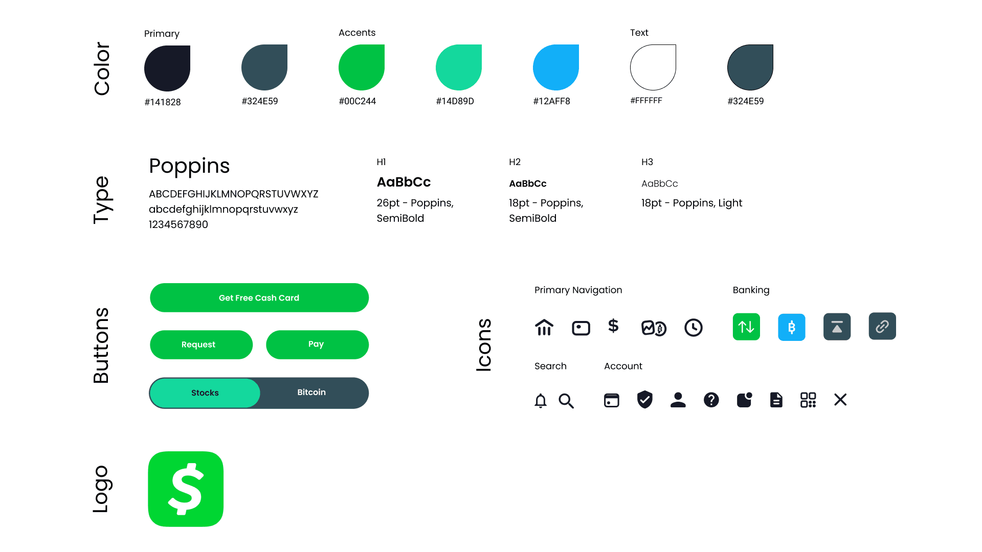
Challenge 2 — Icon Recreation
The recreation of the icons consisted of simple shapes like rectangles with rounded edges, text, and lines. The real challenge was to capture the proper scale and position of all aspects in each icon.
To start simply, the "$" icon in the center is 34pt Red Hat Display, Bold Italicized.
The rest of the icons required a mix of rounded rectangles, stylized lines, and a process of layering or masking different unions of elements.

Challenge 3 — Implementing Something New
Since I do not have access to the digital graphics that Cash App displays throughout their app, I had to create something of my own.
I wanted to challenge myself to develop a new skill by implementing something new and different that I had not done before. The "Cash Credit" screen had to maintain the focus on credit, so I thought, "how about a frosted transparent credit card?"


Takeaways
As someone with a big interest in personal finance, the ideas and inspiration for this UI challenge easily flowed through me and onto the screen. Dark mode has also become a big trend and I often find myself preferring the dark mode version of an app or operating system.
This challenge was perfectly set for a one-week design sprint, and I commonly structure my projects and design process into 1-2 week sprints. This allows me to organize my plan, map deliverables, and quickly mockup or iterate after ideation or research.
The competitive research helped drive my style and color palette choices and it's always interesting to see the different perspectives in the same marketplace.