
Personal Project
Flix Pix
Access all of your streaming services in one place
Project Background
Video platforms are digital these days with the ability to watch what you want, whenever you want. The down side to this is that so much content is available, it's hard to find interesting or new content across all the platforms a user may be subscribed to.
Flix Pix is a mobile movie and TV show discovery app that primarily allows users to browse and launch titles from all of their streaming services in one place. Users can select all of the services they are subscribed to, browse currently streaming and upcoming titles, create watchlists, and find recommendations based on interest and ratings.
Design Challenges
- Provide a simple and seamless discovery experience for finding new titles to watch and enjoy.
- Create an intuitive way for users to add and access all of their streaming services in one location.
- Allow users to see what's new and what's leaving.
- Create an intuitive UI that keeps movie and show titles as the focus, and makes it easy to find details about a title.

Kickoff
In this project, I used "Sharpen" within the Google UX Design Certification course on Coursera to select the initial design prompt: "Create a film trailer app for a theater." Due to COVID-19 and the shut down of movie theaters, I decided to adjust the project scope to meet the needs of the time. Ultimately, the design prompt I built from was "Create a trailer app for video streaming services."
I chose to use a design thinking approach that proved to be very effective in the development of this app. I found qualitative research methods to be the most useful, which consisted of moderated usability studies at both the Lo-Fi and Hi-Fi stages of design. I also conducted a thorough competitive analysis, and hypothesized two user personas.
Initial Questions
Who are the primary users of video streaming services?
Would access to all streaming services in one place help a user find new and interesting content to watch?
Would streaming service users want to access all of their services in one place?
What do primary users need most?
What challenges will I face going forward?
Who are the biggest competitors and how can I differentiate?
Competitive Analysis
Exploring the existing marketplace is something I enjoy being very thorough with. It's great to learn about successful trends in the market and see how other brands are solving similar user problems.
My research began with simple Google searches with phrases like, "Video streaming in one place," "Streaming recommendation apps," and "Streaming hub apps." Aside from my search returning ads for actual streaming platforms, the marketplace for browsing all streaming platforms in one place turned out to be pretty narrow. There are just a handful of high quality apps out there that let users do this.
Next, I downloaded each app to my mobile device and began exploring the UX and UI of each app. I also analyzed the user flow and primary product offerings of each app. The majority of features between competitors are very similar. However, the key differences that I noticed are:
- The app is a hub of all streaming services vs. the app is a title recommendation engine.
- Browse only currently available titles vs. option to see what titles are coming and going in the near future.
- Usability without an account vs. requiring account creation to use.
- No user profile vs. customizable profile with viewing metrics.

Flow Planning & Wireframing
Following my initial user and competitive research, I had a strong sense of what works on existing platforms within the marketplace. This allowed me to develop the initial information architecture and pen and paper sketches for the Flix Pix product.

Meet the Users
Primary
Amy Tulley
31 · HR Manager
Amy works long hours during the week and really enjoys her downtime from dealing with employee complaints. In her free time, she loves to workout, but also quickly relax with familiar characters. Sometimes it's hard to find something new because long movies and new characters can be a big investment.
Secondary
Bill Martino
64 · Sr. Project Manager
Bill is a busy Project Manager who consistently leads multiple high level projects. His work is stressful and demanding. After a long day, Bill wants to escape the stresses of work by watching something fresh, exciting, and entertaining. Bill watches often, so it's sometimes hard to find something new and interesting.
Information Architecture
The IA for Flix Pix was an iterative and evolving map throughout the design process. As you can see above, the initial user flow is quite different from the final IA.
Based on findings in the low fidelity usability study, a key insight showed that some app pages were repetitive or tried to do too much in one place. This led to expanding the IA and primary navigation so users have more clarity and focus on each app page.

Low Fidelity (Lo-Fi)
After developing the initial IA and pen and paper wireframes, I jumped into digital mockups and prototyping with Figma. Here are the Lo-Fi screens and prototypes that were tested with users in a moderated usability study.
The mockups include some visual design aesthetics like branding, copy, icons, and buttons. This helped users interact with the app and add a sense of how the finished product may look and function.

Low Fidelity Prototyping
Interactive functionality added depth of response for the moderated usability study with users.

Research & Testing
Once the Lo-Fi designs were complete, I conducted a moderated usability study with five participants. I specifically sourced participants who subscribe to multiple streaming services and watch at least 3 times per week for at least one hour per viewing session. Participants were asked to complete a series of five tasks that explored core features of the Flix Pix app.
The primary goals of this study were to determine: do users want the ability to access all of their streaming services in one place, and does access to all streaming services in one place help users find new and interesting content to enjoy?
Study Observations
All users in the study saw the benefit and usefulness of accessing all of their streaming services in one place.
- People do want the ability to access their streaming services in one place.
- People want to effortlessly add / remove their streaming services.
- People want to see and engage with lots of details related to a title of interest.
Affinity Diagram


Key Insights
- Text size and the 'Services' feature were too small.
- It was confusing to have streaming service selection ability on all pages. Not immediately clear where to start, or how to add your streaming services.
- Users expect an 'X' to close overlay pages instead of a down arrow.
- Increase the size of the main navigation and add shading to show location.
- Want to see more details about a title of interest.
Feedback
Overall, user response in the study was positive and constructive. Participants felt excited about the concept and saw the need for this solution in the marketplace, but also offered valuable feedback to iterate from.
Iteration
With the key insights listed and prioritized from the usability study, it was time to make updates and improvements. First order of action was to increase text size and the scale of features, icons, and buttons. This initial update was instrumental to the final structure of the app and is seen across all areas of Flix Pix when moving from low to high fidelity.
Primary Navigation — User Location
Users were confused when testing the low fidelity navigation. Solid color and lack of icon shading kept users from knowing their location in the app. High fidelity navigation fixed this issue with on brand colors and icon shading. Users now know exactly where they are in the app at all times.

Focus
Users did not immediately know where to start in the app or how to add their streaming services. This was primarily due to the word "Services" being at the same hierarchical level as "TV Shows" and "Movies". Additionally, users expressed that the services section on top was too small and unclear without visual queues. Overall, this page was trying to do too much and lacked focus.
High fidelity fixed this with larger bold text, larger visual queues for adding streaming services, simplified sorting, and a dedicated "Services" page where users can see what's new or leaving soon.

Navigational Clarity
Flix Pix makes effective use of overlay pages that pull up to access details of various features. Users expressed confusion with the use of down arrows to close overlay pages. When exploring this further, all users expected an "X" to close overlay pages and felt that an "X" was a more intuitive navigation for this function.

More Title Details
Users want deep engagement with titles of interest. Low fidelity was lacking when it came to the details and supplemental information for a title of interest. Users expected to access similar titles, a cast and crew roster, critic and viewer reviews, and trivia (fun facts).

High Fidelity (Hi-Fi)
With the usability study insights applied, the high fidelity designs brought Flix Pix to life with a polished dark theme, refined navigation, and rich title detail screens. The jump from Lo-Fi to Hi-Fi is dramatic — every screen was rethought with a stronger focus on visual hierarchy, accessibility, and user clarity.

High Fidelity Prototyping

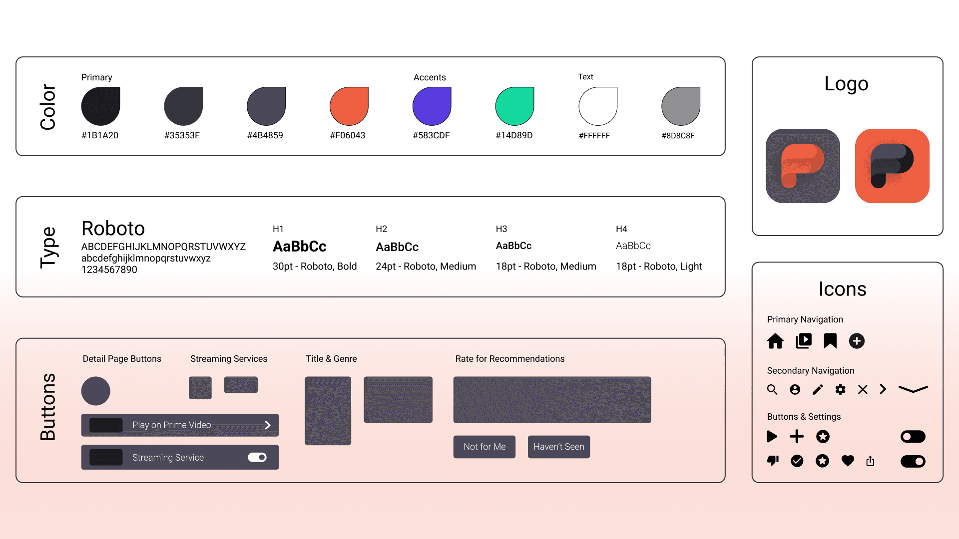
Style Guide
- Since the primary focus of Flix Pix is to showcase movie and show titles that a user may watch, I decided to utilize a dark theme with popping accents for contrast and visual interest. This palette felt perfect for Flix Pix's branding (especially for a video focused app).
- The typeface of choice for the app is Roboto. I felt that this typeface is bold, modern, accessible for users, highly versatile, and has a slightly retro / vintage feel to the early days of cinema.
- Inspiration for the app's logo came from its initials "F.P." and my desire to create something simple and contemporary.
- Icons for the app were sourced from Google Material Icons.
Takeaways
Flix Pix was my first mobile app build and what a fun experience it was. My passions for video and movie production were free to shine while I also wanted to create a contemporary platform with a focus on the titles and details.
This project really showed me that wireframing, IA, mockups, and iteration are my stronger areas of the design process. Going forward, I am working on further building my skills in user research and testing. I will also focus on user persona development.
Next steps for Flix Pix would be more user testing and feedback in its high fidelity state. This would help to further polish the platform and consider adding nice to have features.